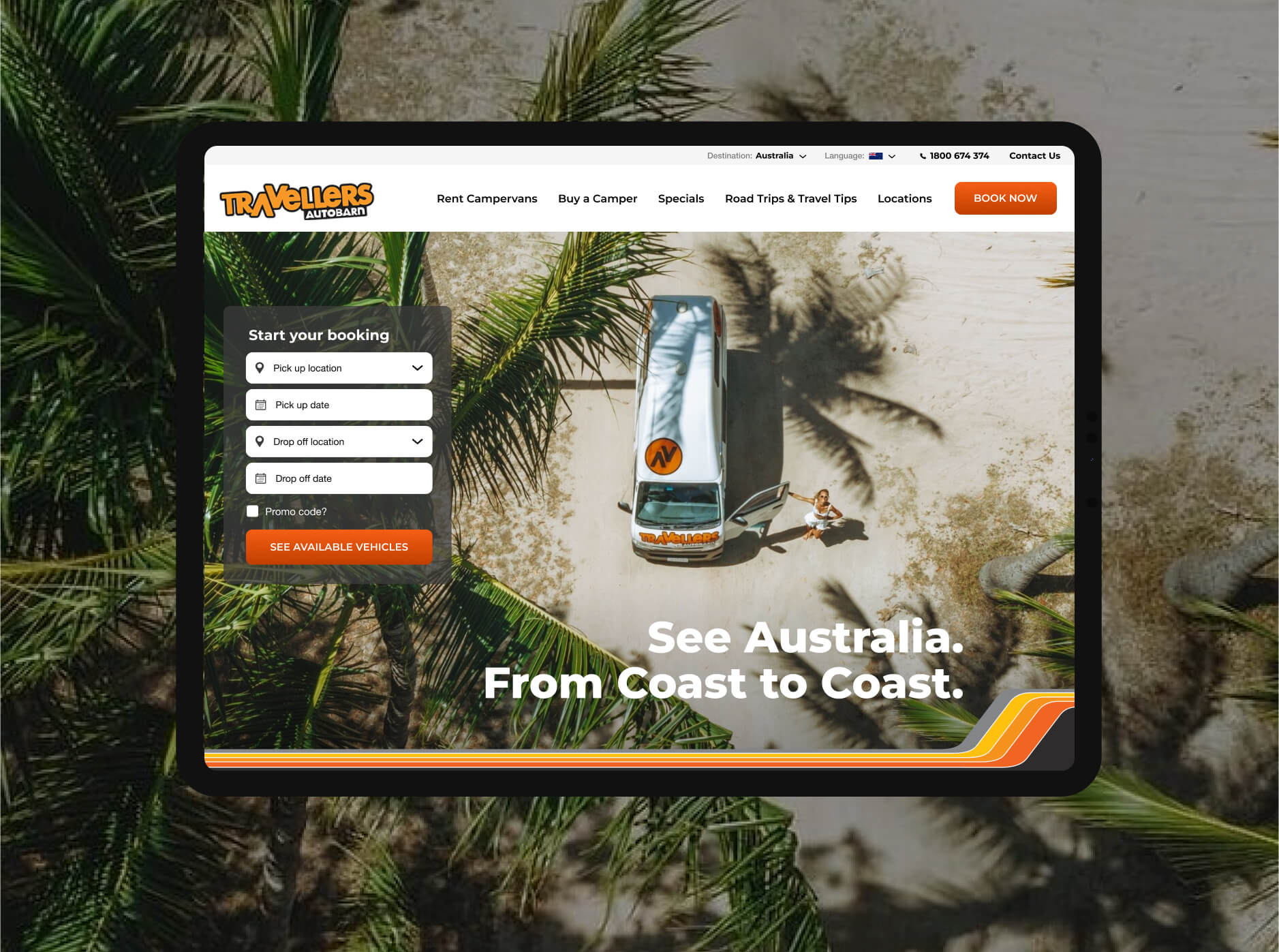
Travellers Autobarn, campervan rental with a retro feel
Travellers Autobarn needed a site refresh. The brief was to keep the site youthful, Australian relevant and BUSY. For SEO reasons the homepage needed 900 words minimum and the client liked the feel that there was a lot going on. No minimalism pls!
I created design concepts and iterated with two rounds of client feedback. Templates and internal pages were rolled out by a junior designer.
Role
Competitive analysis
Information architecture
Wireframes
Hi-Fi Designs


Modular and SEO driven content
The client wanted the site to be flexible and modular. Each element was designed to be reused on any page in any order. Detailed wireframes were created in collaboration with a junior designer.

The brand’s retro vibe gave it a point of difference
During brand research I was drawn to the retro decals on the US vans. Leaning into this 70s surfer, retro feel gave the site a point of difference and helped promoted a sense of freedom.
Choosing images with sepia tones supported the vintage feel and selecting a deep orange (over red) as a highlight colour gave it some softness.
I restructured the navigation, simplified the booking widget and promoted deals to give the site a modern browsing experience.
Original site