Specify Hub – filling the gap between builders and homeowners
A paper trail costing everyone time and money
The founder had spent years in the building industry watching the same frustration repeat itself – miscommunication between clients, trades and builders over fittings and fixtures caused costly delays and disputes. Decisions lived in spreadsheets, text threads, and emails. Nothing connected.
She saw a clear gap: a mobile-first tool that could bring the whole selection process into one place, simple enough for a builder on site but powerful enough to manage a full project.
4
User types considered
3 months
To dev-ready
40
Screens designed


Process
Pressure testing the idea
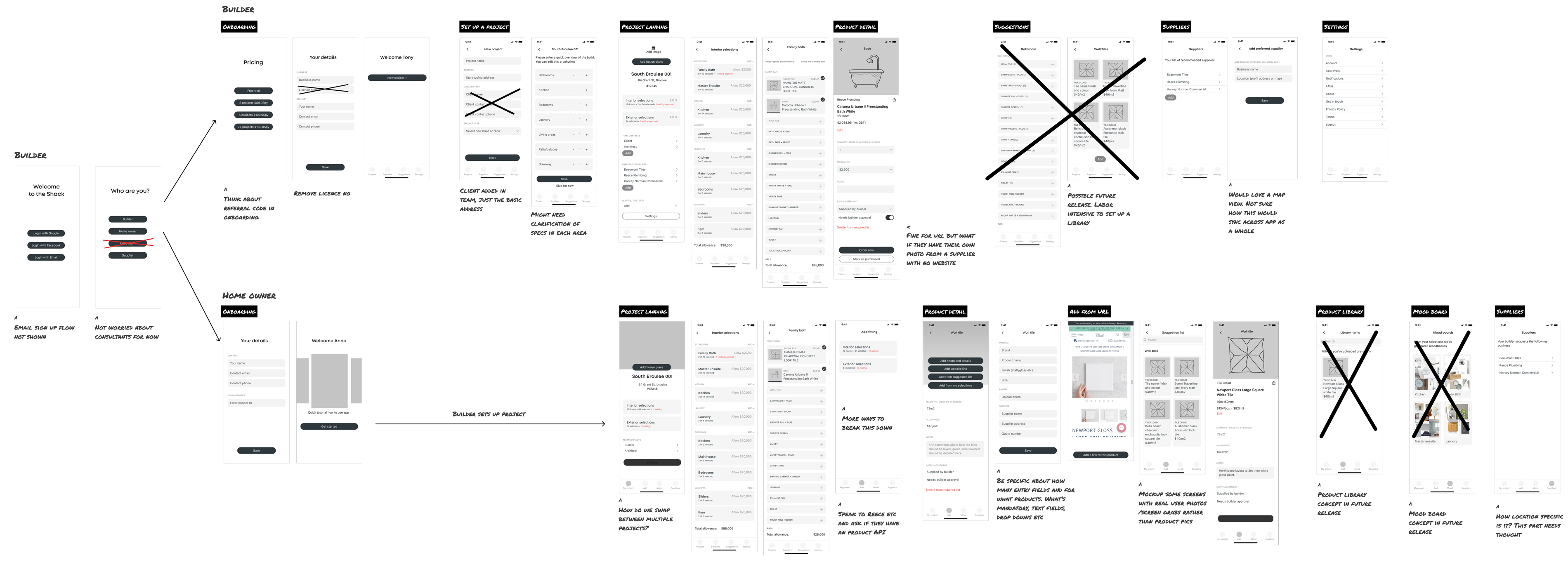
Over two collaborative working sessions, the founder and I unpacked her vision and translated it into basic wireframes.
We then reviewed the flows with the developer to validate feasibility and define a realistic scope for the first release.
Several ideas didn’t pass this feasibility check – including mood boards, product libraries, a desktop interface, item-level costing and budget tracking.
What remained was a clear core concept and a buildable idea.
Design approach
Creating the brand made it feel real
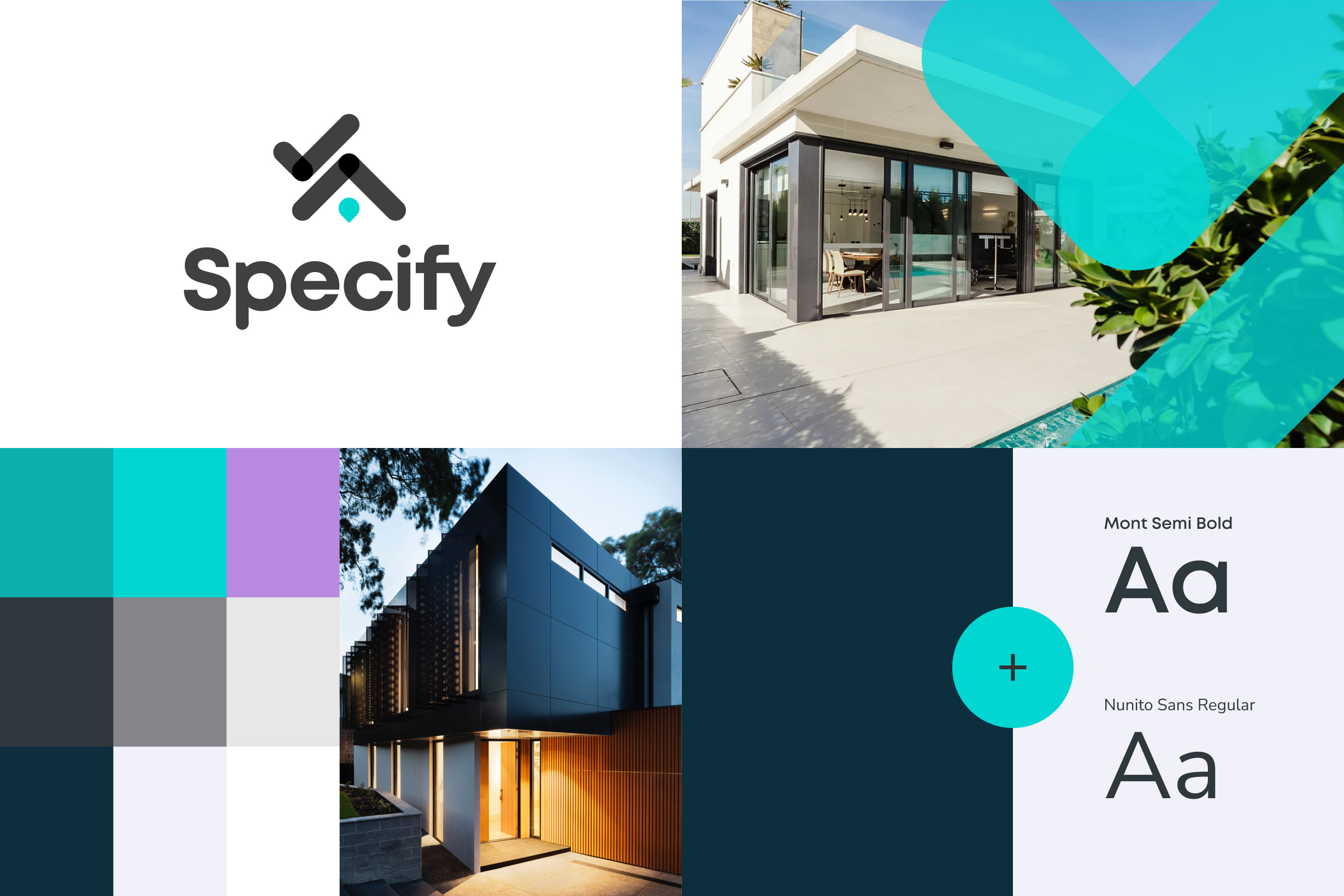
The founder and I worked closely on naming, then I moved straight into visualising the brand. Developing a clear visual identity helped solidify the concept and shift it from an idea into a tangible business.
The builder is the power user – design around them
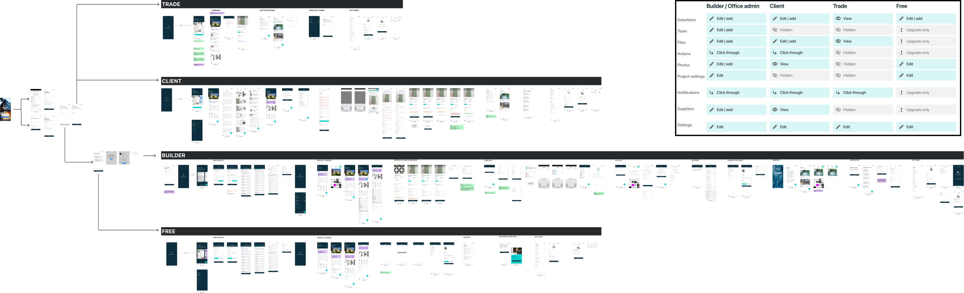
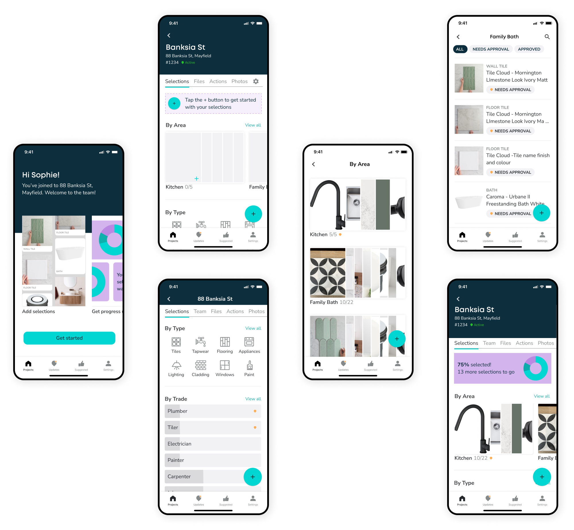
We mapped four user types. Builders were at the centre: they set up projects, defined the detail, owned the subscription and brought clients and trades onto the platform. That hierarchy shaped every design decision.
Builders needed to be able to start a new project one-handed, onsite, without missing important detail. They could then share the project with the client who could add their selections.
Challenge
Product URLs don’t come with a standard
Enabling clients add products via website URL was a no brainer – but supplier websites don’t share metadata standards and building individual API integrations was out of scope.
We decided to pull in whatever was available automatically and ask the client to fill the gaps. Tiles were the most complex product type so I worked backwards from there to stress-test the pattern.
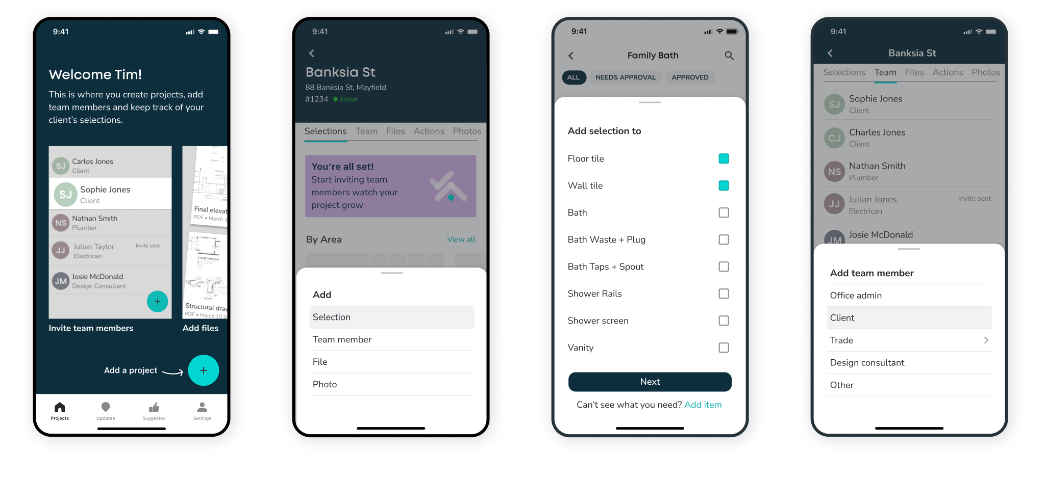
The contextual plus button surfaced different options depending on where you were in the app – a small detail that reduced cognitive load without hiding functionality.
Outcome
Live in the App Store in early 2024
After almost a year in development the app was released to the App Store and Google Play early 2024.
Being a lean, waterfall process, there wasn’t budget for formal user testing, feedback loops and iterations. Instead the design decisions were grounded in the founder’s deep industry knowledge and validated through collaborative working sessions.
“I’m so incredibly appreciative of everything you’ve done. Seeing a vision come to life is so great and you’ve been so integral in that above and beyond my original expectations.”
Bree, founder Specify Hub